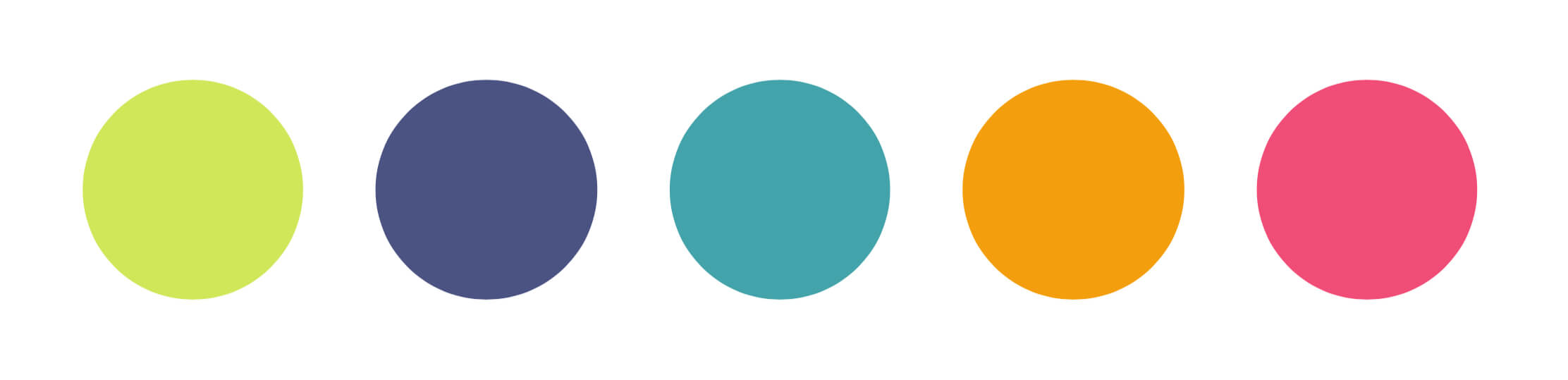
Hmm, my favourite colours: imperialist yellowy green, ordained cobalt, inhaling peacock blue, scorned mango, or unalienable pinkish? Maybe not!
The boring thing moving my mailing list* has been negotiating all the files and data fields and tags and segments. The fun thing with moving things to Flodesk is how easy it is to make it look beautiful. The pre-selected colour options are lovely but you can also set default colours in whatever # code you like.
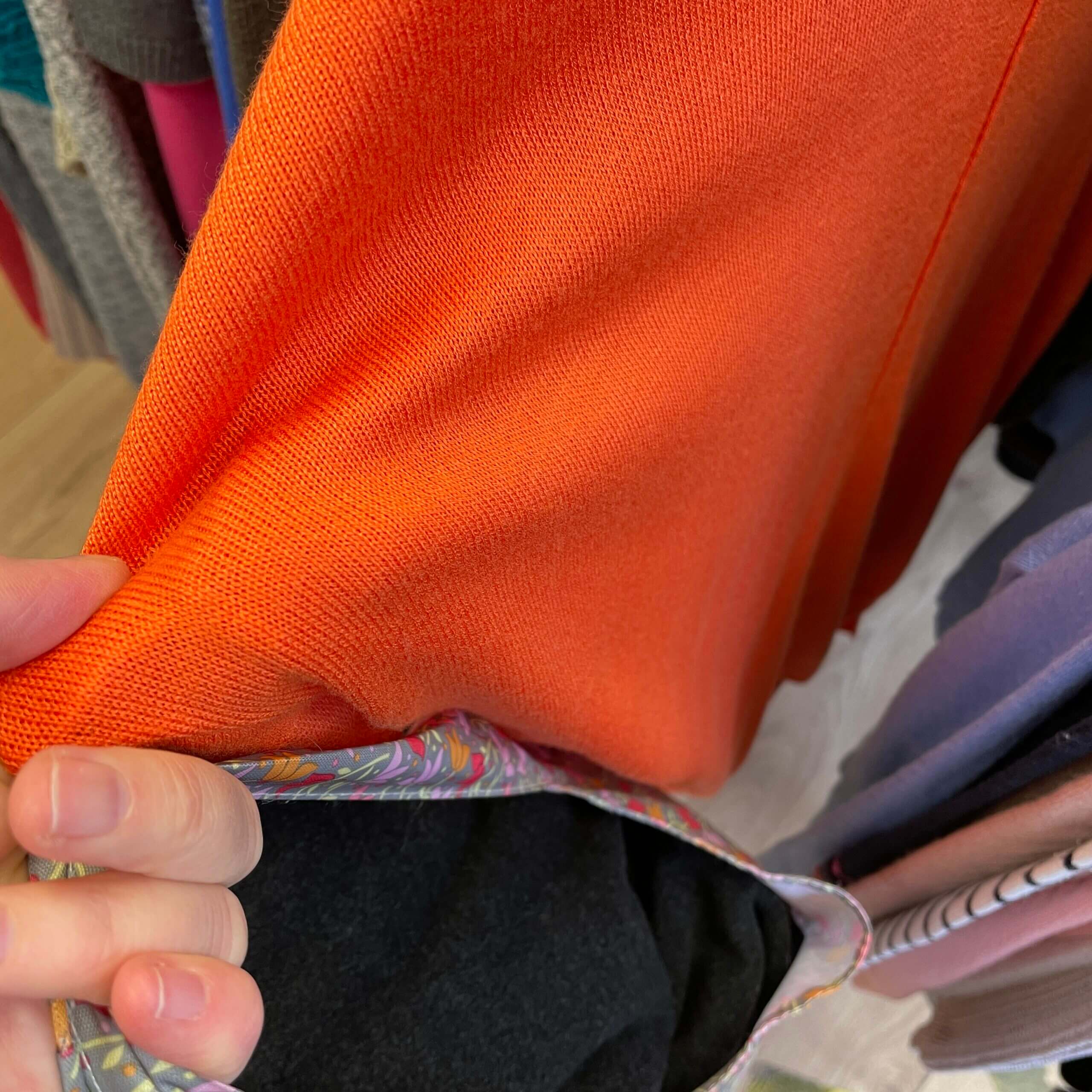
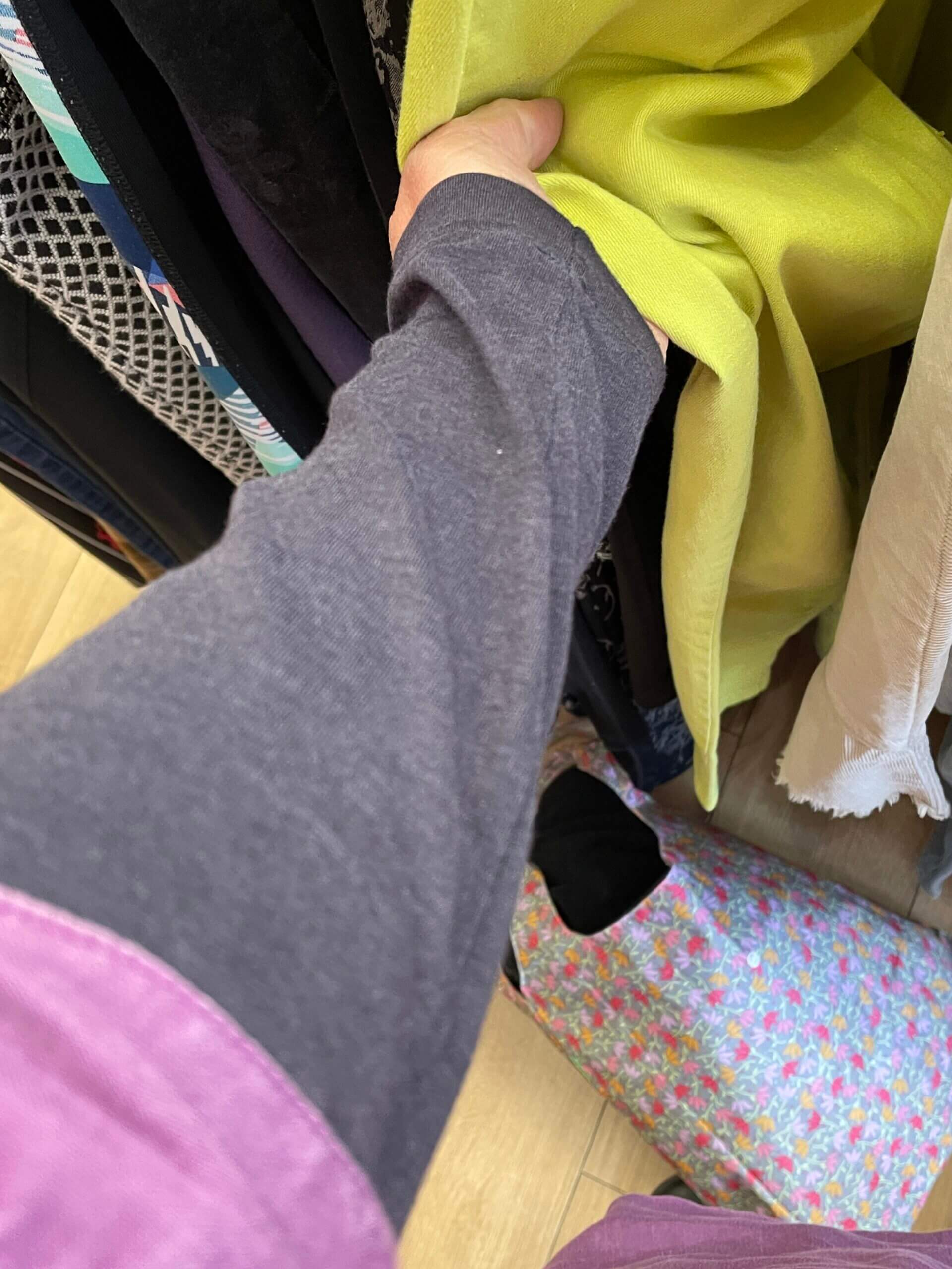
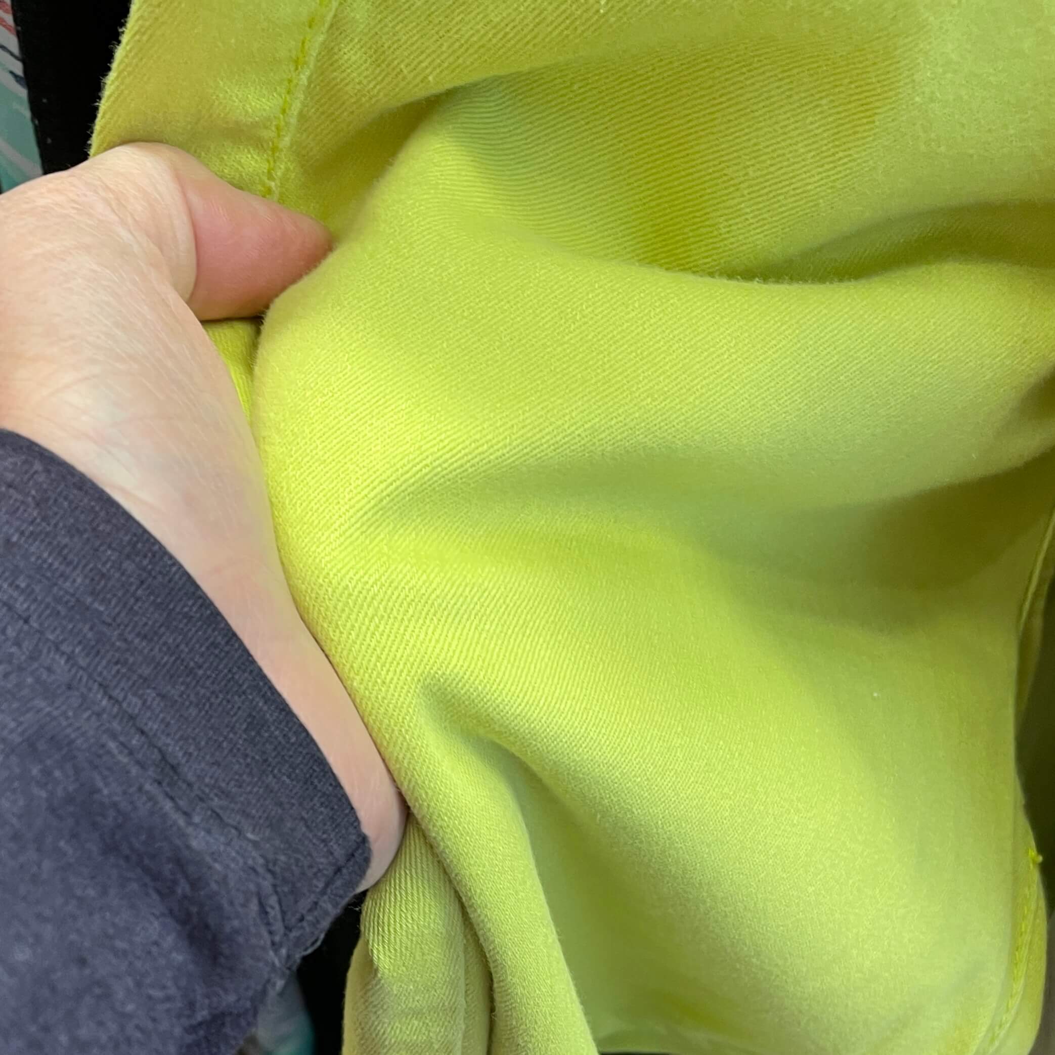
My starting point was an impromptu visit to a charity shop when I went into town for a contact lens check. I always pop into the Oxfam shop next door to the optometrist, as I’m under permanent orders from my husband to buy a bag of fudge every time I pass.
As well as the things I found on the racks (but didn’t buy, just took photos) I discovered, when my sleeve photobombed, that my purple linen top was a fun contrast too!
When I got home, I tried to find colours that matched what I remembered from the shop, but also felt like “me”. The hardest thing was working between my laptop and my ipad, as the colours look completely different on different devices. I ended up losing charcoal from the mix, even though I love it as a dark, as it only left me with four colours for Flodesk. So I added a muted blue (with a hint of pink/purple) instead.
So how did I find the hex codes? Colour scheme apps. Huge fun.
The one I use most is Coolors. The desktop version is easiest to use, but there’s an app too. I love it because you can upload a photo (or a URL) and it generates a palette from that. It takes a bit of working out how to use it, but you could easily lose a day playing around…I did.
Colors.lol is also fun (see above!) – it even has a Twitter account – but is mostly useless unless you want a giggle!
I naturally wanted to use my favourite colours, but didn’t want them to look like an array of ice cream flavours. I wanted them to be inspiring to use, energising, and feel like “me”. There’s something about seeing these colours together, overlaid, next to each other, as well as individually…they make me happy, and invigorate me too. I like that they’re bright, but not garish or overpowering; quieter, but not muted and dull.
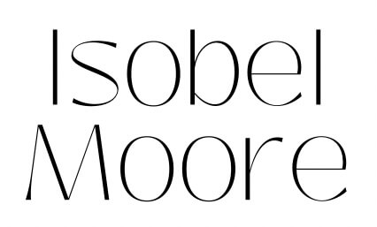
I just love the way they look on the screen, and I’m tempted to incorporate this screen shot of them into my logo (which I made by doodling my name, playing with spacing, then using Canva and playing with fonts until found something I liked).
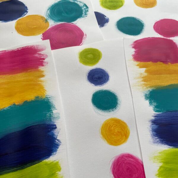
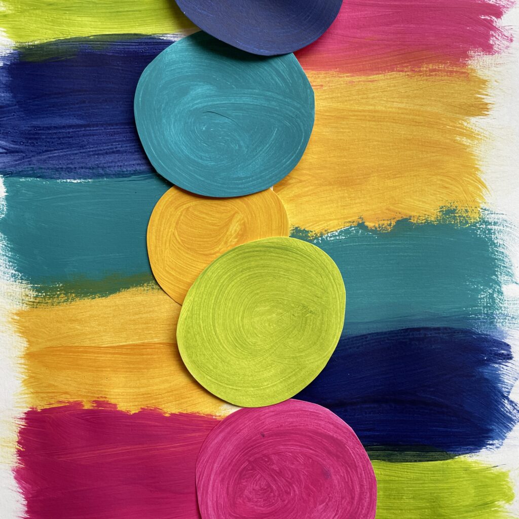
Today, I propped my ipad up on my countertop and mixed paint colours to try and replicate my palette. Took a while, but I think I nailed it in the end. The turquoise was the hardest. I smeared the leftover paint onto a sketchbook spread, but want to go back in and experiment more with them another time.
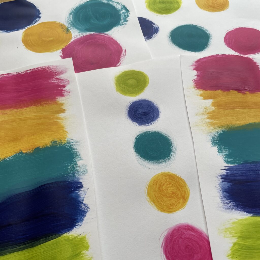
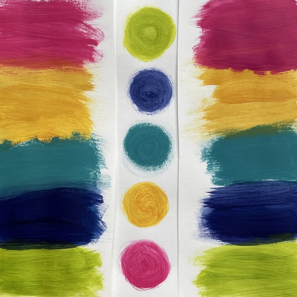
I used Prussian blue, ochre and lemon yellow, process magenta, and the merest hint of white.
At the same time as trying to choose my 5 Flodesk colours, I’ve been trying to choose some new watercolours for my mini set – again, choosing colours that I love instead of the ones that come in the box off the shelf. I got a bit hung up on whether to have burnt or raw umber and/or sienna. All shades of yellowyreddybrown!

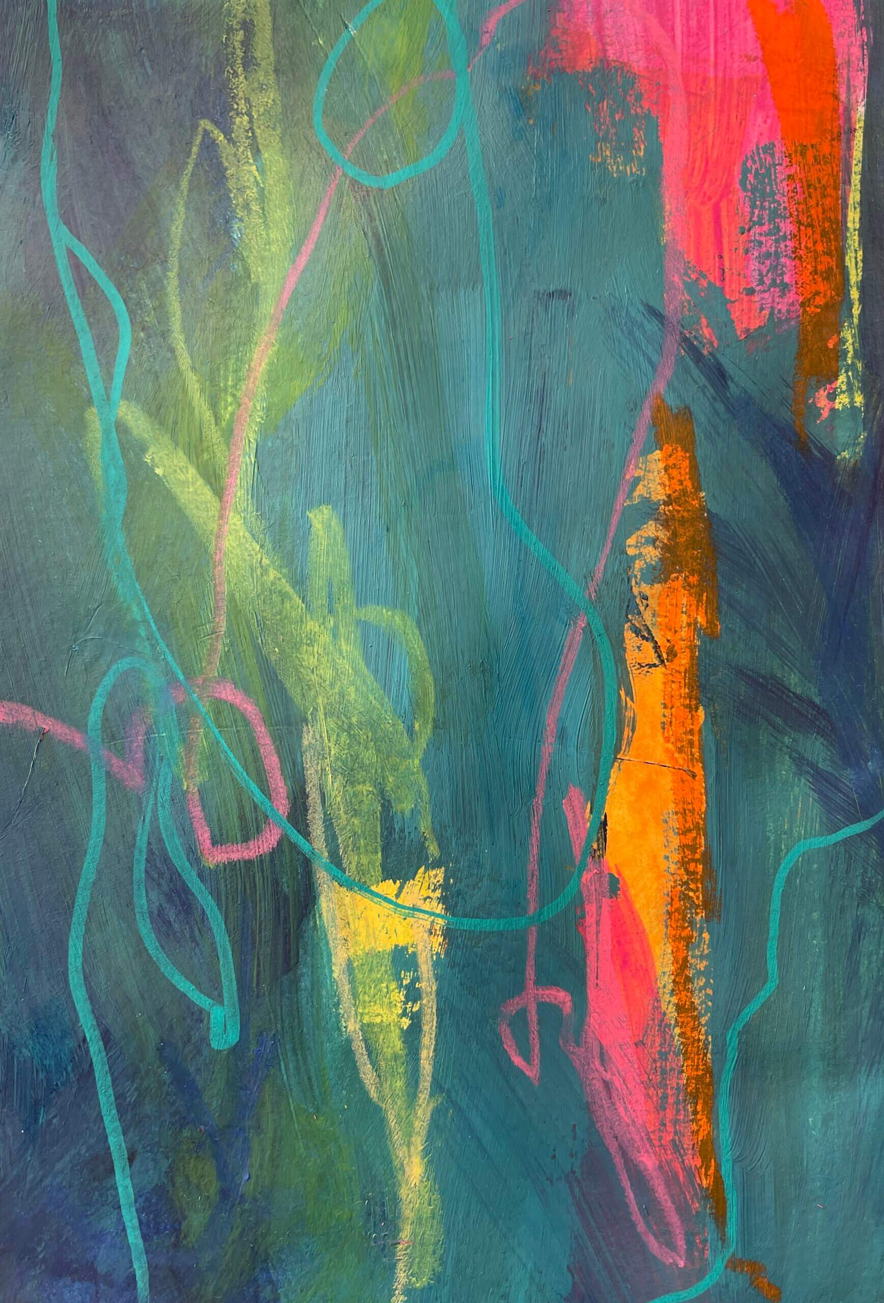
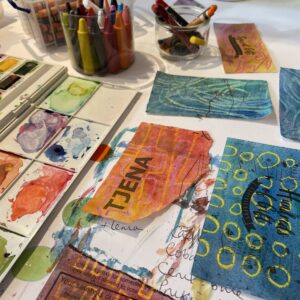
I like to try paints out on straight onto my table top (covered with a huge sheet of white card). It feels very naughty. I used some today (and some from a bigger palette) to make some collage paper pieces for the stash, and the best bit of all is the paint that goes over the edge onto the card.
How about you? Could you choose five colours? Just five colours to represent you? Which would you choose?
*if you’d like to sign up to my new colourful newsletter, you can do so here!
One thought to “Choosing my colours”