This is my process for sifting through my collections of “inspiration” (all secondary sources) to tune in to what it is that interests me, and what I’d like to explore in my own work.
It’s easiest to do with physical images rather than digital – printouts of your own work, print outs of other people’s work, famous (or not so famous) paintings, cuttings of images you like from magazines, or actual artists cards or postcards. You’ll also need a notepad and pen or pencil, to make notes about the process and your thoughts as they arise.
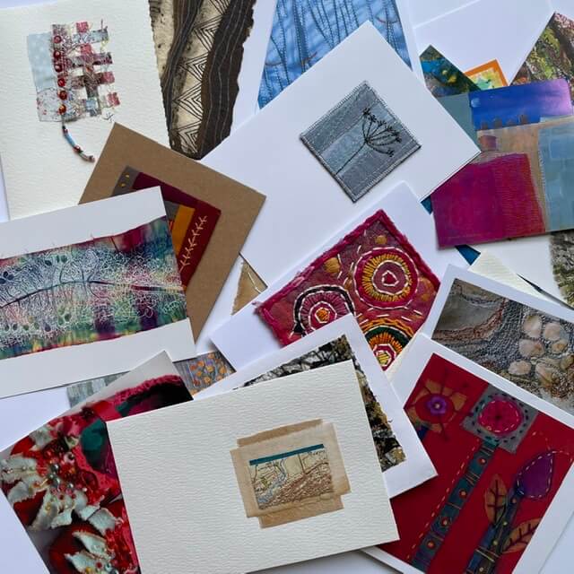
Go through your collection, and choose the ones that are speaking to you today. Maybe choose up to 20 or 30. Depending on how many you have in total, you’ll need to start to make decisions. Start to notice how you’re deciding.
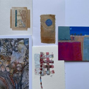
When you have your selection, lay them out on the table in front of you and have a look. Are there similarities? Are they abstract or representational? Colourful or muted? Delicate or bold? Textile or paint?
Then, whittle down your collection by half. Choose – this one or that one? And notice again, why you’re deciding to keep some and discard others.
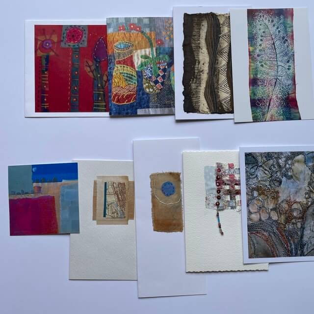
Repeat until you have just a handful.


What was it about these that trumped everything else? If someone was to do this on your behalf, could you describe any “rules” to guide them in their decision making? Are there key words or adjectives that could describe them? Write about the lines, the shapes, the textures, the colour, the composition, the mood, whatever comes to mind. Write as much as you can – it might feel odd and slightly daft when you start, but once you get into it it’s easier!
When I’ve done this, I’ve come up with really bizarre things – like “branching, stretching, not cramped or squashed” and “dashed, broken, balanced irregularity, ripped edges but balanced composition, feathery not fat, curved, bold but not harsh, soft-edged boldly curved shapes, not fiddly or straight or boxy”.
For the selection above, I’ve written…
natural, frayed, worn, aged, paper, dry, blocks, muted colours, cool colours, texture, simple lines, papery texture, pastel colours, irregular/offset grid, small embellishments, constrained, naive/simple stitches, organic forms, circles, meanders…
The next step is optional, but interesting to do if you can grab a willing participant: ask a family member or friend to look at your selection. What do they see?
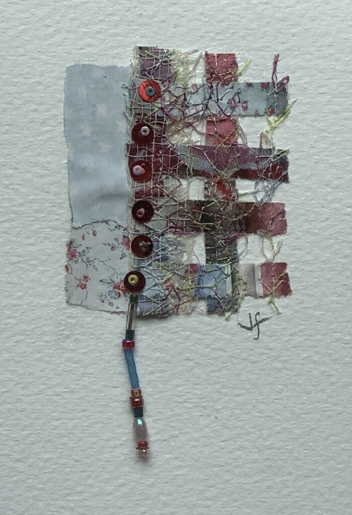
jellyfish, seashell, string, sinewy, fragile, lines, edges, bonded, layered, placed, positioned, arranged, curves, earth, sand, blue, coast
The next step could be to explore these ideas in a sketchbook or in stitch, whatever your “thing” is. Whatever you do next, this exploration will hopefully have helped to refine not only what you want to do, but how you want to do it.
Let me know if it was helpful!
4 Thoughts to “Tuning in”